Who invented city dashboards?
The concept of a digital dashboard, a graphical user interface that provides an at-a-glance view of key performance indicators relevant to a particular objective or business process, didn't spring fully formed into the urban planning sphere. Its roots extend back to the simple information displays found in automobiles—the literal dashboard—which summarized vital operational data like speed and fuel levels for the driver. In the computing world, this terminology began to take hold around the mid-1990s, primarily within the realm of Business Intelligence (BI). These early BI dashboards were revolutionary for presenting complex operational data visually, moving away from dense reports to something immediately digestible.
# Computing Origins
The general term "dashboard" in computing, referring to a centralized screen displaying metrics, gained traction because it conveyed the idea of an operator monitoring a complex system. Before this digital standardization, data presentation often involved static reports or complex charting software that required significant effort to interpret. The evolution into a true dashboard format was driven by the need for real-time monitoring, a concept that would later be scaled up from tracking sales figures to tracking civic performance.
# Mission Control
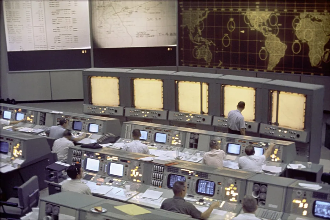
While BI dashboards provided the format, the dramatic inspiration for applying this monitoring concept to an entire city environment often traces back to the high-stakes world of aerospace engineering. NASA’s Mission Control centers, especially those involved in the Mercury, Gemini, and Apollo space programs, perfected the art of centralized, real-time data monitoring. These rooms were the ultimate urban dashboards of their time, displaying telemetry, system statuses, and environmental readings necessary for making immediate, mission-critical decisions. The visual environment, filled with screens and status lights, became the archetype for future control rooms, including those proposed for cities.
The architecture of Mission Control established a visual hierarchy: the most important information was displayed prominently, guiding the attention of a diverse group of experts working collaboratively. This centralized command structure provided a clear template for how to manage incredibly complex systems—whether it was a spacecraft millions of miles away or the interconnected infrastructure of a metropolis.

# Data Display
The underlying technology supporting these centers evolved from mainframe computing displays to graphical interfaces, enabling the creation of the visual tools we recognize today. In the context of urban studies, the shift wasn't just about displaying data, but displaying spatial data—data tied to geography—in an easily consumable way. Academic exploration into what constituted an "urban dashboard" began to mature as the availability of real-time urban data sources (like smart meters or traffic sensors) increased. This led researchers to question how best to translate the highly technical visuals of Mission Control into something accessible and relevant for city management and citizens.
It is insightful to note the difference in operational mandate between the inspiration and the eventual application. NASA's dashboards served a singular, binary goal: mission success or failure, life or death. In contrast, early city dashboards, such as those emerging in the 2010s, were often designed not for immediate crisis response but for research, transparency, and community engagement, prioritizing public understanding over singular operational control. This conceptual pivot—from closed, critical control to open, public insight—marks a significant divergence in the purpose of the "dashboard" concept.
# Urban Emergence
While the idea of a city command center has long existed in science fiction and strategic planning, the practical implementation of the digital city dashboard as we now understand it is a relatively recent phenomenon, closely tied to the rise of "smart city" initiatives and open data movements. One of the well-documented examples in the academic literature is the City Dashboard project launched at University College London (UCL) in May 2012. This specific initiative focused on making data visible in public spaces to prompt discussion about energy use and consumption habits among residents.
The development of urban dashboards is often situated within the broader context of understanding spatial media, where designers and researchers work to map complex urban realities onto visible displays. These early deployments weren't just about putting numbers on a screen; they involved careful design choices regarding what data to show and how to visualize it to prompt behavioral change or inform policy. For instance, a dashboard focused purely on visualizing traffic congestion might serve one purpose, while one comparing neighborhood energy consumption side-by-side—as suggested by some early research models—aims for a different social outcome.
The transition from a general concept to a specific municipal tool required navigating significant technical and ethical hurdles. Simply aggregating data from disparate municipal sources—transportation, utilities, safety reports—into one coherent view is technically challenging. Furthermore, deciding which metrics are appropriate for public display versus those that must remain secure or private requires a level of governance distinct from that needed for a private company’s BI suite.
# Design Distinction
When examining the history, it becomes clear that the "inventor" isn't a single person or even a single project, but rather an evolution driven by technological availability meeting civic aspiration. The first true urban dashboards synthesized three streams:
- The visual presentation style of computing dashboards (BI systems).
- The real-time monitoring ethos of Mission Control.
- The need to visualize complex geospatial information relevant to urban life.
A key element distinguishing a city dashboard from an enterprise BI dashboard is the audience expectation regarding data latency and scope. An enterprise dashboard might refresh hourly or daily with high data integrity guaranteed within the organization. A city dashboard, particularly one intended for public view, often requires near real-time updates (e.g., transit tracking) and must handle data feeds from numerous, often non-standardized, city agencies. A useful guideline emerging from these early projects is that for public engagement to work, the metric displayed must be actionable by the observer, or at least comprehensible enough to spur civic dialogue. Displaying raw sensor readings without context, for example, often fails to connect with the public, regardless of how sophisticated the underlying visualization engine is.
| Feature | Enterprise BI Dashboard | Early City Dashboard (Research Focus) |
|---|---|---|
| Primary Goal | Internal operational efficiency/Profit | Public awareness/Research/Policy feedback |
| Data Source Type | Internal, unified databases | Multiple external, sometimes proprietary sources |
| Criticality | Medium to High (Financial Impact) | Medium (Quality of Life/Sustainability) |
| Refresh Rate | Minutes to Hours | Seconds to Minutes (depending on metric) |
The historical thread shows that once the capability existed—powerful visualization software and widespread sensor deployment—the immediate intellectual leap was to apply it to the largest, most complex "system" familiar to citizens: their city. The formalization and naming of the "urban dashboard" solidified as researchers and designers began applying lessons from spatial media studies to make these data streams meaningful indicators of urban health, rather than just collections of statistics.
Related Questions
#Citations
Mission Control: A History of the Urban Dashboard - Places Journal
A History of 'Urban Dashboards' and their Impact on City Governance
History of the Urban Dashboard - ResearchGate
Mission Control: A History of the Urban Dashboard
History of the Urban Dashboard - Andy Nash
City Dashboard is launched - University College London
Understanding Spatial Media - Urban Dashboards
A Brief History of Data Visualization - Dundas BI
Creating design guidelines for building city dashboards from a ...
Dashboard (computing) - Wikipedia