Who invented the heat map?
The visualization technique we now commonly call the heat map is not the product of a single moment or one singular inventor, but rather a slow accretion of ideas stretching back well over a century, finally coalescing around a specific term in the early 1990s. Today, heatmaps are indispensable across fields from User Experience (UX) design to genomics, offering an immediate, intuitive grasp of complex, two-dimensional data. To understand who invented the heatmap, we must trace not just the coining of the name, but the origin of the underlying principle: representing data magnitude through color intensity on a matrix.
# Early Shading
The conceptual roots of the heatmap predate the internet, computers, and even the official term by many decades. In the early 1800s, accountants and mathematicians were already employing simplified methods to shade matrices, using variations in darkness to flag areas of interest in their numerical tables. These early attempts were functional but lacked formal documentation, leaving their creators anonymous in the historical record.
The first well-documented, recognizable precursor to the modern heatmap emerged in 1873 from the work of Toussaint Loua, a noted French statistician. Loua sought to visualize complex social statistics—such as profession, age, and national origin—across the various arrondissements (districts) of Paris. To manage this large dataset on paper, Loua created a hand-drawn, color-shaded matrix. He employed a scale that moved from white (low values) through yellow and blue, culminating in red for the highest values, utilizing a system derived from consolidating data from forty separate source maps into one cohesive visual summary. This groundbreaking 1873 display established the fundamental concept: using a gradient of color to encode the magnitude of data points within a spatial or categorical grid.
Not long after Loua’s visualization, another significant step toward structured data display occurred with Francis Galton in 1881. Galton produced what might be classified as an early isochrone map, showing travel times from London to various global locations using distinct colors for different time bands. While not a true matrix heatmap, Galton’s work demonstrated the public appeal of mapping intensity—in this case, travel duration—via color gradients.
# Ordering Structure
Coloring a matrix is one element; making that matrix reveal structure is another, equally vital part of the heatmap's story. The visualization technique needed ways to group related items to make patterns leap out at the viewer.
The initial methodical approach to this was introduced by Flinders Petrie in 1899, who devised seriation—the idea of reordering the rows and columns of a data matrix to expose inherent structure. This concept of systematic arrangement was refined substantially in 1950 when Louis Guttman developed the Scalogram, a method specifically designed to order binary matrices (data scored as 1 or 0) to uncover an underlying one-dimensional scale.
The link between these statistical ordering methods and the emerging visual format was solidified by Peter Sneath in 1957. Sneath used the permutation technique, which placed similar rows and columns near each other based on cluster analysis results. This concept became executable in 1973 when Robert Ling created the computer program SHADE, which used overstruck printer characters to simulate different shades of gray for each "pixel" in the matrix. By 1980, Dennis Rondinelli synthesized these ideas, visualizing Guttman’s scalability technique in a form that was both colored and arranged according to a merit order, summarizing facility statistics for settlements. These steps show that the move from an initial color display to a truly analytical heatmap required the integration of mathematical ordering principles developed decades before digital graphics became commonplace.

# Naming The Concept
Despite this century-long history of shaded matrices and ordered displays, the specific name "Heat map" is much newer. The term itself was coined by software designer Cormac Kinney in 1991. Kinney’s innovation was not inventing the coloring technique, but rather applying it to a specific digital context: describing computer software that displayed real-time financial market information. Kinney and his team were responsible for developing the first true computer-generated heatmaps, initially for this high-speed finance use case.
It is fascinating to consider that the name itself was a branding effort; Kinney successfully trademarked the term in the early 90s. This proprietary ownership, however, did not last. The trademark was eventually transferred to SS&C Technologies in 1998, but because the company failed to renew or extend the license, the term became annulled in 2006, opening it up for public, universal use across data visualization.
The final breakthrough in bringing the heatmap to its current prominence came with high-resolution digital rendering. While Kinney introduced the computer-generated concept around 1991–1993, Leland Wilkinson developed what is recognized as the first computer program (SYSTAT) in 1994 capable of producing cluster heat maps utilizing high-resolution color graphics. This technological leap—moving past rudimentary printer characters to sophisticated, scalable color representation—was essential for the visualization to migrate out of purely statistical or niche financial software and into broader scientific and commercial use.
# Digital Ubiquity
Once the technology allowed for precise, high-resolution rendering, the utility of heatmaps exploded across diverse disciplines. In biology, for example, the technique proved invaluable for visualizing gene expression patterns, as demonstrated in the seminal work by Eisen et al. in 1998.
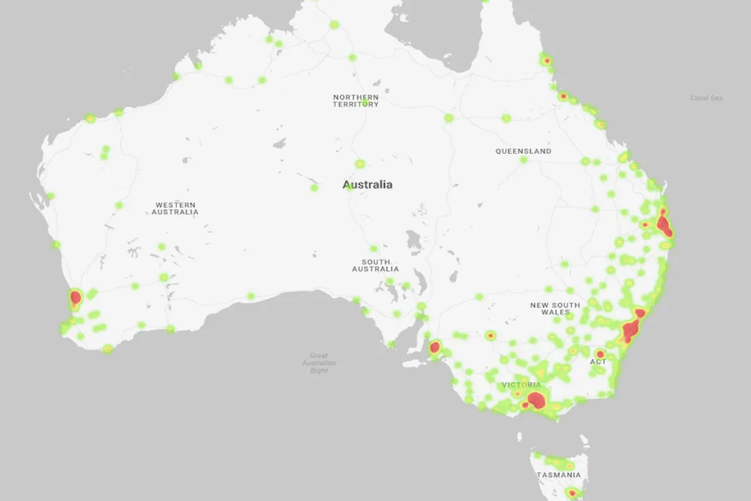
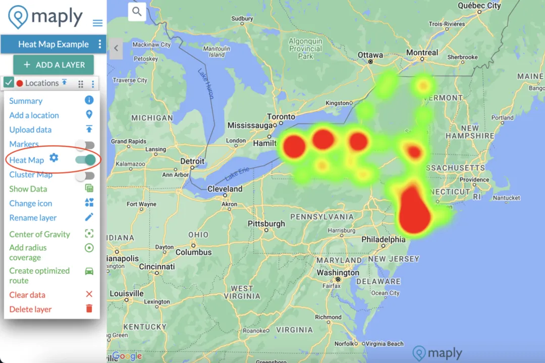
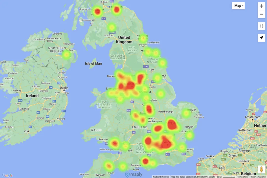
However, the most significant popularization of the concept outside of specialized research circles came with the rise of the internet. As web traffic grew, so did the demand to see where users were pointing their cursors, scrolling, and clicking. While the underlying principles of Loua’s 1873 matrix were present, the application to user behavior on a website needed a commercial supply chain. This need was met around 2006, when companies like Crazy Egg began selling specific heatmap analytics designed to track user interactions on web pages, effectively creating the web analytics heatmap market. This commercial adoption made the colorful intensity map a standard feature for optimizing digital products.
The democratization of this powerful tool continued through open-source development. In 2013, Michael Waskom introduced the Seaborn Python package, providing an aesthetically refined, easy-to-use function for generating heatmaps within the increasingly popular programming language. This move accelerated adoption in data science, much like Wilkinson’s earlier SYSTAT paved the way for high-quality statistical visualization.
The evolution continues today with tools like Heatmapper2, which rewrote the older Heatmapper from R to Python and introduced WebAssembly to move intensive computations to the user’s browser, resulting in performance gains up to 100 times faster than its predecessor. This modern adaptation underscores that the "invention" of the heatmap is an ongoing process of optimization for scale and accessibility, allowing researchers to handle massive datasets in genomics or epidemiology with interactive 3D or time-series representations.
# Distinguishing Contributions
It is important to distinguish between the different roles in the heatmap's development. Loua was the visual originator of the color-coded matrix for social data in 1873. Petrie and Guttman were the structural architects who provided the mathematical basis for ordering data effectively. Wilkinson provided the high-resolution rendering capability for clustered data via computer. Cormac Kinney stands out as the nomenclature inventor, securing the term "heatmap" for the digital finance sector in 1991. Without Loua, we’d have a manually shaded matrix; without Kinney, we might call it a density plot or an intensity map.
Interestingly, the very nature of human sight dictates that the effectiveness of any heatmap depends entirely on the colors chosen, a factor that has evolved significantly from Loua’s four hand-mixed colors. Modern data scientists recognize that using simple gradients, such as those moving from blue to red, can be problematic because the human eye struggles to objectively compare shades when they are not adjacent. This is analogous to the famous 'checker shadow illusion,' where perceived shade depends on relative context rather than absolute value. This realization is why modern, high-quality scientific tools now favor perceptually uniform color sets, like the Viridis family, which ensure that an equal change in data value corresponds to an equal change in perceived color, thereby enhancing accuracy, especially for those with color vision deficiencies. The development of these better color schemes is a contemporary layer of invention built upon the foundation laid by the pioneers of matrix shading.
Ultimately, no single person invented the heatmap; rather, it is a visualization forged across eras. It began with a statistician’s colored squares in Paris in the 1870s, was refined by statisticians ordering data in the mid-20th century, was digitally enabled by software engineers in the early 90s, and received its enduring name from an entrepreneur in the financial markets. Its continued evolution proves that even concepts that seem fully formed are subject to improvement based on new technologies and a deeper understanding of human perception.
Related Questions
#Citations
Heatmaps - The Decision Lab
Uncovering the heatmap history - Capturly Blog
Heat map - Grokipedia
Hot hot heat map - SAS Blogs
Geographic Heat Map - Mapping Tools and Features - Maply
Heatmapper2: web-enabled heat mapping made easy - PMC
Heat map - Wikipedia
Heat Maps: Types, Benefits & How to Use Them - NetSuite