Who invented the bar graph and when?
The development of visual tools for displaying numerical data is a fascinating area of history, and few representations are as instantly recognizable today as the bar graph. [1] This simple yet powerful method of comparing quantities using rectangular bars of length proportional to the values they represent seems almost intuitive, yet its formal invention is tied to a specific period of intellectual and economic awakening in the late 18th century. [3][4] Pinpointing the single individual responsible often requires looking closely at published works and acknowledging different historical claims regarding early conceptualizations. [8]
# Scottish Originator
The individual most frequently credited with inventing the bar chart, alongside other foundational statistical graphics, is William Playfair. [1][3] Playfair, a Scottish civil engineer and political economist, is frequently hailed as the father of statistical graphics. [3] His work marked a significant shift in how economic data—a complex subject at the time—could be presented to a wider audience, moving beyond dense tables of figures. [1][4]
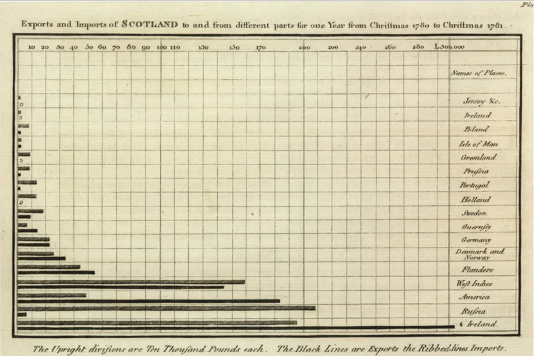
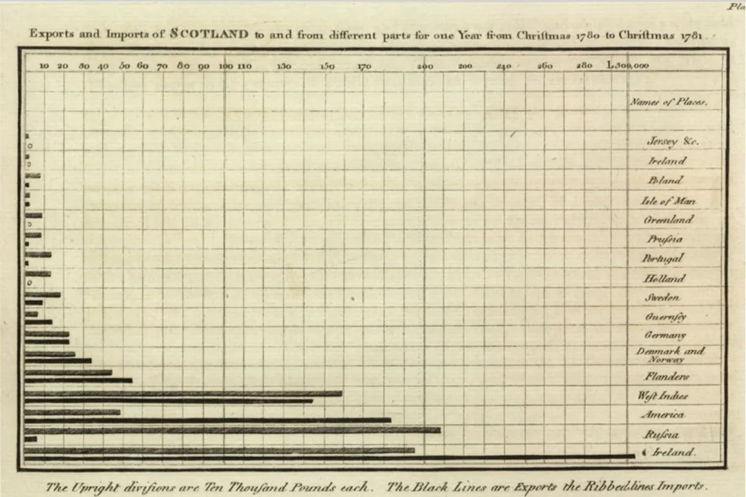
Playfair's monumental contribution came with the publication of his first major work, The Commercial and Political Atlas, in 1786. [1][2][4] Within this atlas, the bar chart made its debut. [2][3][4] This was not just a random sketch; it was a deliberate graphical method designed to convey statistical relationships with clarity. [1] Playfair firmly believed that visual presentation could dramatically improve the understanding of statistical data, particularly for subjects like trade and finance. [4]
It is important to recognize that Playfair didn't just give the world the bar chart in isolation. His innovative spirit extended to other chart types that are now staples of data visualization. [1][3] He is also credited with introducing the pie chart, the circle chart, and the line graph into statistical practice. [1][3] This collection of inventions firmly establishes his authority in this domain, suggesting an inventor with a broad vision for data representation, not just a single novelty. [3]
# Priestley Mentioned
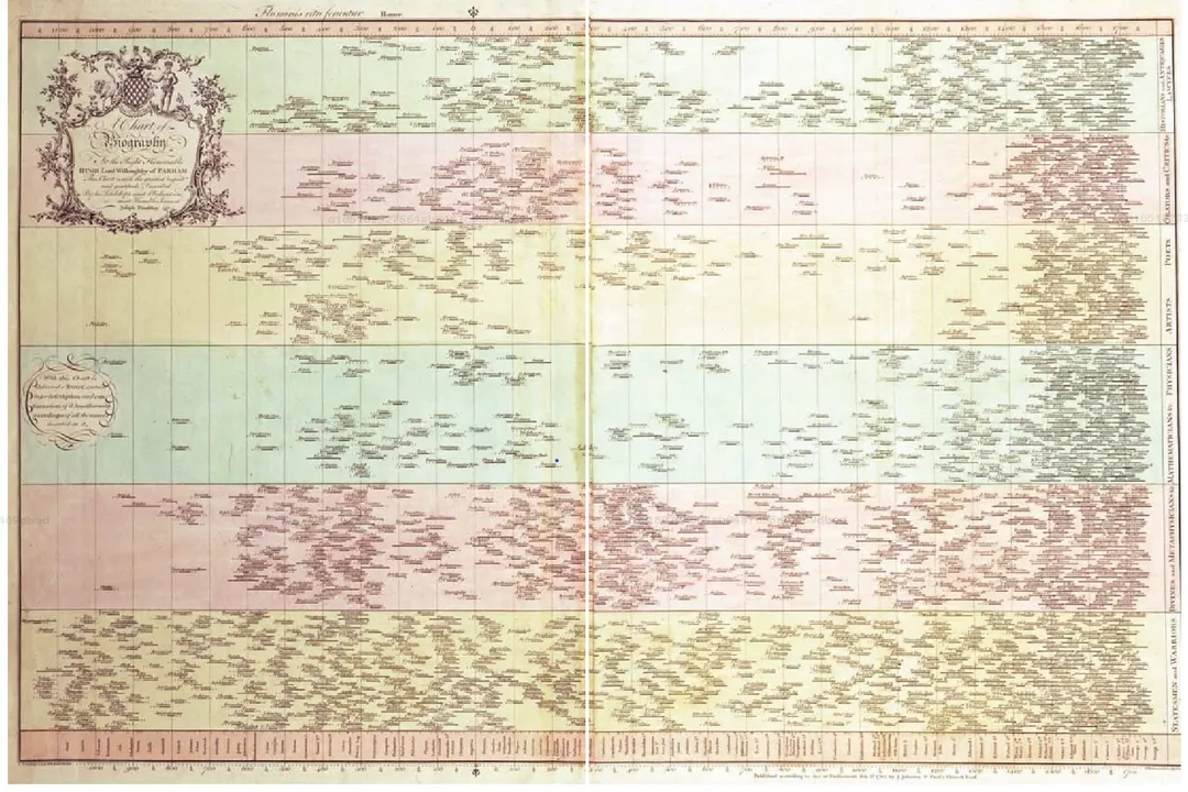
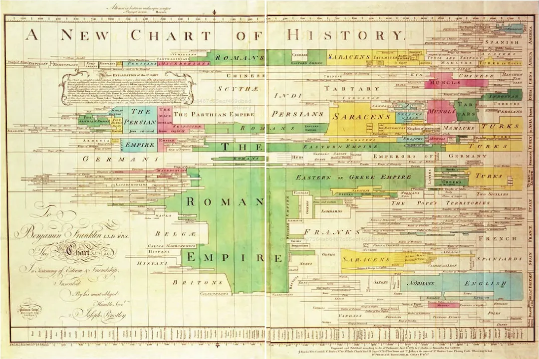
While Playfair solidified the bar chart in the context of political economy, historical records suggest that an earlier, perhaps less formalized, precursor might have existed. [8] Some sources point to the English chemist and philosopher Joseph Priestley. [8]
Priestley is noted for having used a diagram in 1756 that displayed the relative lengths of the reigns of English monarchs. [8] This diagram utilized bars whose lengths visually represented the duration of each monarch’s rule. [8] The key distinction here lies in context and purpose. Priestley’s chart served as a historical or chronological record, demonstrating duration across time. [8] In contrast, Playfair’s 1786 innovation was intended to compare quantities (like imports vs. exports, or trade balances) at specific points in time or across different categories, which is the core function we associate with the modern bar graph used in economic analysis. [1][4]
This difference in application helps explain why Playfair generally receives the formal credit for inventing the bar chart as a statistical tool rather than Priestley receiving credit for an earlier chronological bar-like representation. [3] Playfair systematically applied the concept to the emerging field of statistics, which demanded tools to show variation and comparison in contemporary data. [4]

# Charts Role
Playfair’s early graphical works were deeply intertwined with the economic realities and political discourse of his era. [4] The Commercial and Political Atlas aimed to present complex trade data, such as the imports and exports of Great Britain with various nations, making the data accessible for political decision-making. [1][4]
To give a sense of the data Playfair was tackling, consider a simplified look at the context:
| Data Type | Purpose in Early Graphs | Playfair's Tool |
|---|---|---|
| Trade Volumes | Comparing value across countries | Bar Chart [1][4] |
| Revenue/Expenditure | Showing flow over time | Line Graph [1] |
| Proportions | Showing market share or debt breakdown | Pie/Circle Chart [1] |
The bar chart, specifically, excels at direct comparison. If you look at an early iteration, it is immediately clear which bar is longer, which nation imported more, or which year saw a greater export surplus without needing to reference an accompanying table. [3] This visual immediacy was revolutionary in an age where data analysis was often confined to dense tables and lengthy prose. [1]
# Visual Evolution
William Playfair’s dedication to graphical representation did not stop with his first atlas. He continued to refine and expand his methods over the next two decades. [3] After the 1786 publication, he followed up with Statistical Account of the British Empire in 1801, which further utilized his graphical techniques. [1]
The core principle—using the length of a bar to represent magnitude—remained constant, but the application evolved. While the 1786 bars were straightforward comparative devices, later uses, sometimes called column charts when oriented vertically, provided a standardized way to view statistical changes year-over-year, laying groundwork for time-series analysis. [4]
A fascinating point, often overlooked when discussing the 'invention,' is the required leap of faith from a user base accustomed only to textual or tabular data. For Playfair’s charts to gain traction, people needed to trust the visual representation implicitly. [3] This trust required the charts to be meticulously scaled and clearly labeled, something Playfair emphasized in his writings, ensuring that the visual impact did not supersede factual accuracy. [4] When we look at the historical context of the late 18th century, with the nascent formalization of statistics as a discipline, Playfair was essentially creating the language for the data revolution that followed in the next century. [3] The very act of formalizing the bar chart was an act of asserting the authority of empirical evidence over anecdotal description in public policy.
The simplicity of the bar chart is deceptive. In a world increasingly defined by large-scale commerce and national statistics, the need for an easily digestible summary was paramount. The bar chart filled this need perfectly because it requires minimal cognitive effort to interpret relative size, unlike more complex graphical methods that might have been available or subsequently invented. The fact that the same basic structure—a Cartesian coordinate system with bars against one axis—is still in use today speaks volumes about the inherent effectiveness of Playfair’s original design choice for comparative visualization. [1][4] The consistency of the design across centuries is perhaps the greatest testament to its initial quality. [3] It is this enduring simplicity, perhaps more than any single publication date, that cements the bar chart's place as a fundamental element of information design.
#Videos
Who Invented Bar Charts: Was It William Playfair? - YouTube
Related Questions
#Citations
William Playfair - Wikipedia
First Ever Bar Charts Created in 14th Century | AnyChart News
Masters series: William Playfair, the father of statistical graphics
Historical Spotlight: William Playfair - The Data School
Who Invented Bar Charts: Was It William Playfair? - YouTube
History of Bar Charts and Graphs
Bar Chart in Data Visualisations for Better Decision-Making
Bar Charts invented by Joseph Priestley in 1756 - Mosaicproject's Blog
The bad boy of bar charts: William Playfair - Engora Data Blog