Who created the chasing arrows?

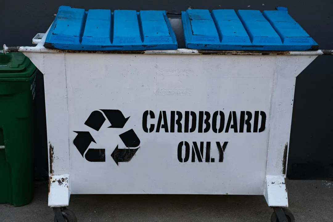
The iconic symbol of the recycling loop, the chasing arrows, has become a universal shorthand for environmental consciousness, yet the story of its creation is rooted in a specific design challenge from the early 1970s. The creator was Gary Anderson, who was then an architecture student at the University of Southern California (USC). [1] In 1970, Anderson entered a national competition aiming to establish a universal symbol for recyclable materials. [1][7] This contest was sponsored by the Container Corporation of America (CCA), a major packaging manufacturer looking for a mark of distinction for its recycled paperboard. [1][7]
# Student Design

Anderson’s winning concept was selected from approximately 230 submissions, a testament to the power of simplicity in communication. [1] His design wasn't born in a vacuum; he drew inspiration from the pre-existing Mobius strip, which symbolizes infinity. [1] However, Anderson adapted this concept to specifically represent the process of recycling, making it directly applicable to consumer packaging and waste management initiatives. [1] He received a prize of $2,500 for his creation. [1]
# Contest Setting

The context of the 1970 competition is crucial to understanding the symbol's original intent. While many people today assume the symbol indicates that an item is currently being recycled curbside or is easily recyclable, Anderson’s original vision was more aspirational than descriptive of immediate, widespread infrastructure. [1] It was designed for the CCA to mark products made from recycled materials, signifying that the material could be cycled back into production. [7] This distinction between made from recycled content and is accepted in your local program is a central source of modern confusion surrounding the symbol. [6]
# Design Concept

The essence of the chasing arrows logo lies in its representation of a continuous cycle involving three distinct stages. [3][5] These three arrows stand for collection, the process where used materials are gathered; manufacturing, where those collected items are processed into new goods; and finally, purchase and reuse by the consumer, which closes the loop and feeds back into the collection stage. [3][5] The shape ensures that no single stage is emphasized over the others, underscoring the cyclical nature of sustainability efforts. [5]
It is interesting to note the evolution of the visual representation itself. Anderson's initial design, sometimes described as having arrows making a 90-degree turn, was later overlaid with the continuous Mobius loop aesthetic that is now most recognized globally. [1] This standardization, while aiding recognition, also blurred the explicit three-part message Anderson intended to convey through distinct arrow paths. [1]
# Symbol Evolution
Following its creation, the symbol quickly gained traction far beyond the initial scope intended by the CCA. [7] It became the de facto standard for recycling across the United States and internationally, largely because it was clear, relatively simple, and conveyed the necessary concept visually. [7] This grassroots adoption meant that the symbol’s meaning began to be applied flexibly, often conflating different aspects of the recycling stream.
By the early 1980s, states and environmental groups began advocating for clearer labeling, leading to regulations that often tied the symbol to specific Resin Identification Codes (RICs). [9] These RICs, which are the numbers one through seven inside the chasing arrows, are meant to identify the type of plastic resin used, not necessarily the item’s actual recyclability in a given municipality. [6][9]
If we examine the general adoption trajectory, we see that the symbol’s power lay in its immediate, universal appeal to the idea of conservation, even before standardized collection systems were in place across the country. A municipality starting a pilot recycling program in the late 1970s, for instance, could adopt the symbol on its bins immediately to signal intent, long before federal standards dictated its use, highlighting how quickly the design transcended its corporate origins. [7]
| Stage Represented | Primary Action | Connection to Consumer |
|---|---|---|
| Arrow 1 | Collection | Placing item in the correct bin [3] |
| Arrow 2 | Manufacturing | The material is reprocessed into new goods [5] |
| Arrow 3 | Purchase/Reuse | Buying the item made from recycled content [5] |
# Modern Critique
Despite its ubiquity, the chasing arrows symbol is frequently criticized today for its ambiguity, which can lead to consumer confusion and "wish-cycling"—the act of placing non-recyclable items in the recycling bin hoping they can be processed. [6][9] The New York Times noted that the symbol often fails because the presence of the chasing arrows does not guarantee that a local program accepts that specific material. [9] For example, plastic items marked with a RIC 3, 6, or 7 are often not accepted curbside in many areas, yet the symbol’s presence implies a cycle is possible. [6]
This disconnect stems directly from the symbol’s original purpose versus its later regulatory application. Anderson designed it to signal potential for recycling in a material made from recycled content, whereas municipalities now use it (or it is perceived to mean) acceptability in their local processing facilities. [1][9] The complexity of modern plastics, with various additives and composite materials, means that even if the resin itself can be theoretically recycled, the local facility’s machinery might not be equipped to handle it efficiently or economically. [6]
# Designer’s Intent
Gary Anderson himself has commented on the symbol's later misapplication, noting that he never intended for the Mobius loop to be used universally to indicate whether a product was recyclable at that time or place. [1] His design was a generic mark for recycling as a concept, a philosophical representation of circularity. [1]
This brings to mind an interesting point about early environmental design: Anderson was tasked with creating a symbol when the modern, complex infrastructure of single-stream processing and global material markets did not exist as they do today. His design was inherently forward-looking, betting on future capabilities rather than reflecting the current reality of 1970s waste management. It was a blueprint for what society should do, rather than a label for what it was doing. [7]
The responsibility for clarifying the symbol’s meaning has since fallen to bodies like the Environmental Protection Agency (EPA) and local waste management authorities. [9] The EPA has worked to provide better guidance, recognizing that a single, positive symbol used too broadly can mask the necessary nuances of local collection requirements. [9]
For consumers navigating this landscape, the practical takeaway remains: the symbol points to the material's potential but never guarantees acceptance by your local service provider. [6] One practical step consumers can take, often overlooked when relying solely on the logo, is to check the specific RIC number against their local city or county recycling guide before placing an item in the bin. If the guide does not list that specific number (e.g., Plastic #5 or #2), the chasing arrows mark, regardless of how prominent they are on the package, should be treated as a suggestion rather than an instruction to recycle curbside. [9] This layered approach, combining the visual cue with explicit local instructions, honors both the initial design intent and the practical realities of modern material recovery facilities.
Related Questions
#Citations
Gary Anderson (designer)
The myth about the chasing arrows
Column: What is the 'Chasing Arrows' logo, and what does ...
In 1970, Gary Anderson designed the iconic recycling ...
The recycling symbol's Aspen roots
The Hidden Truth Behind Recycling Labels Revealed
A Look at the History of Recycling and the Chasing Arrows ...
General Information on Recycling in Connecticut
His Recycling Symbol Is Everywhere. The EPA Says It ...

