Who designed the emergency exit sign?

The glowing green figure moving perpetually toward the edge of the frame is one of the most recognized symbols globally, yet pinning down the singular inventor of the modern emergency exit sign is complicated. It is less about a single flash of genius in a vacuum and more about a gradual, often tragic, evolution from simple illumination to internationally standardized pictogram. The very concept of lighting an exit arose from the need to guide people out of smoke-filled darkness, but the visual language used to convey that message has been refined over decades.
The earliest attempts to address emergency egress were rudimentary. Before standardized electrical lighting was common, there was little consistency. When illuminated signs did begin to appear, they often relied simply on the word "EXIT" displayed in block letters within a glass box housing a light source. This approach, while better than total darkness, suffered from immediate limitations: what happens when the viewer does not speak the language of the illuminated word? Or when the sign is obscured by smoke, rendering the text illegible?
# Japanese Genesis
The crucial shift from textual command to universal graphic representation originated in Japan, long before it became standard in many Western nations. The modern, running figure—often referred to as the "Running Man"—was conceived in the late 1970s. This design is attributed to Yukio Ota, who created the now-iconic symbol in 1979. Ota developed this pictogram in response to a competition hosted by the Japan Building Maintenance Association.
While Ota designed the figure, it took a little time for the concept to solidify into regulatory compliance. The running figure symbol, designated as the hikōchi sign, was officially standardized in Japan shortly thereafter, in 1980. This standardization marked a profound departure from text-only signage, recognizing that human reaction time is faster when processing a simple graphic than when reading and translating a word, especially under stress. It is fascinating to consider that this design has been in active use in one of the world’s most technologically advanced nations for nearly half a century, contrasting sharply with the slower adoption rate seen elsewhere.
# Disaster Driving Design
The global push toward adopting the universally recognizable symbol gained significant momentum following devastating fires where signage proved inadequate. Two events, in particular, served as grim catalysts for change: the King's Cross fire in London in 1987 and the Happy Land Social Club fire in the Bronx, New York, in 1990. In situations of panic, smoke, and darkness, linguistic barriers disappeared, but the clarity of the visual guide became paramount. People needed to know instantly which direction to move.
This need for instant recognition fueled efforts by international bodies to create a unified visual vocabulary for safety. The International Organization for Standardization (ISO) played a key role in developing standards for safety signs, promoting pictograms like the running man to ensure that an evacuation route meant the same thing whether you were in Tokyo, Toronto, or Timbuktu.

# The American Transition
In the United States, the path to the Running Man was notably slower, often remaining tethered to the word "EXIT" for much longer. Early US safety codes heavily favored the English word. However, evolving accessibility standards and a growing understanding of international safety best practices eventually necessitated a change.
The official transition in the US didn't occur until much later, driven by the NFPA 101 Life Safety Code. The standard for adopting the running man pictogram was established in the 2003 edition of the code, effectively mandating the switch from textual signs to the graphic symbol for new constructions and major renovations. This meant that for nearly two decades after Ota’s design was standardized in Japan, many American buildings relied on signs that were inherently inaccessible to non-English speakers or those with reading difficulties in an emergency. This regulatory lag highlights a common friction point in global standardization: the inertia of existing infrastructure versus the clear benefits of a new, superior standard.
# Pictograms Versus Text
The superiority of the pictogram lies in basic cognitive processing. When viewing the word "EXIT," the brain must perform several steps: see the letters, decode the word into English, and then understand the command. This process takes measurable time. In a rapidly developing fire scenario, even a second lost in translation can be critical.
The running man symbol bypasses the linguistic center of the brain almost entirely. It communicates direction and urgency through pure visual association—a figure moving away from a space, indicating the path to safety. Furthermore, unlike text, which is subject to language, the figure is almost universally interpreted as showing direction toward an exit, making it inherently superior for multilingual environments, such as international airports or tourist destinations.
| Sign Type | Primary Communication Method | Language Dependency | Typical Reaction Speed |
|---|---|---|---|
| Text ("EXIT") | Linguistic Decoding | High | Slower (Requires reading) |
| Pictogram (Running Man) | Symbolic Association | Low to None | Faster (Visual recognition) |
| Early Illumination | Simple Light Source | None | Dependent on visibility |
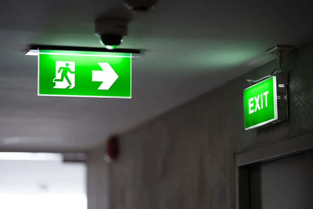
The modern running man sign often utilizes the internationally recognized ISO 7010 standard graphics, frequently shown in white on a green background, though red versions are also used depending on specific local regulations. The design itself is simple: a figure with one leg forward, arms bent, positioned next to an arrow indicating the direction of travel. This simplicity is its strength, allowing it to remain clear even when the illumination dims or the sign is partially damaged.

# Accessibility Considerations
The evolution of the emergency exit sign is also deeply tied to accessibility for people with disabilities. The move toward graphic signage naturally supported those with visual or cognitive impairments, but further refinements have been necessary to ensure true universal accessibility.
Modern standards address not just where the sign is, but how it is presented. For instance, the running man sign must be mounted at the correct height to be visible to wheelchair users, and its illumination must be consistent enough to prevent flicker that could disorient individuals with photosensitive conditions. Furthermore, tactile and auditory elements are sometimes incorporated in specialized applications to aid the visually impaired, moving the concept beyond just a visual aid into a multi-sensory communication tool.
When considering the design criteria, one often overlooked factor is the luminance contrast. For any illuminated sign to function, the contrast between the illuminated graphic and the background must be sufficient across the range of ambient light conditions it will face—from bright midday sun streaming through an atrium window to complete blackout during a power failure. The specifications dictating the required lux levels for both the sign and the surrounding space are highly technical, ensuring that the design, created initially as a simple stick figure, performs reliably under the most extreme conditions.
# From Concept to Code
So, while Yukio Ota is credited with designing the symbol that defines the modern exit sign following his 1979 concept, the actual "designer" of the signage system we obey today is a collection of international safety bodies and national fire safety commissions. Ota provided the visual core; organizations like the ISO and the NFPA provided the regulatory structure that forced its global acceptance.
The adoption process in many regions involved a significant cost investment for building owners to retrofit older structures with the new, illuminated pictogram signs compliant with the latest Life Safety Codes. The final product—a small, often unnoticed green icon—represents a remarkable convergence of graphic design aesthetics, cognitive psychology, and emergency engineering, all stemming from a simple human need: finding the way out safely.
#Videos
A Brief History of the Exit Sign | ARTiculations - YouTube
Related Questions
#Citations
Exit sign - Wikipedia
A Brief History of the Japanese Exit Sign (also known as the ...
Understanding the Running Man Exit Sign: A Guide to Safety and ...
Running Man Exit Sign
Designs That Defined Modern Japan: The Emergency Exit Sign
A Brief History of the Exit Sign | ARTiculations - YouTube
A Brief History of the EXIT Sign | The Exit Light Co., Inc. Blog
The Running Man on the Emergency Exit Signs: What's his Story?
Who first invented lit up exit signs in buildings? Was it as a reaction ...
“Walk, Don't Run” - The History Of Fire Exit Signs