What is the history of the running man exit sign?
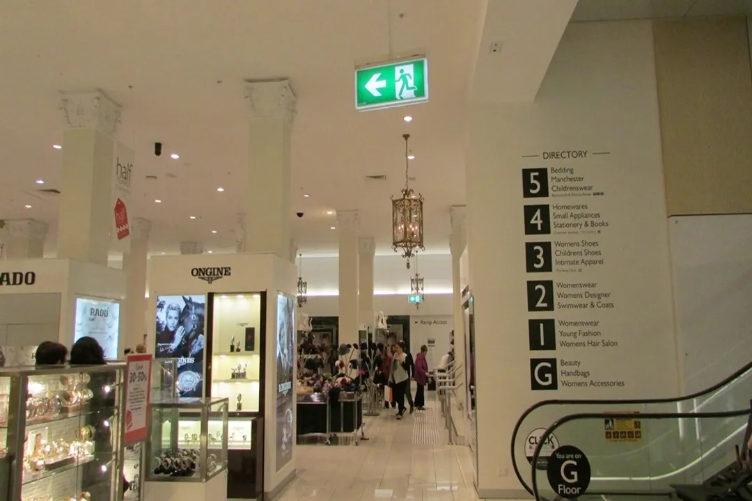
The universal symbol of the running human figure, universally green or white against a contrasting background, guides millions through buildings every day, yet its history is surprisingly recent and deeply rooted in international cooperation. This pictogram, instantly recognizable across linguistic divides, represents a significant evolution in safety signage, moving away from written instructions toward pure, immediate visual communication. [8] It signals the quickest route to safety during an emergency, a simple instruction conveyed by a figure in perpetual motion toward an exit door. [1]
# Text Dominance
Before the "running man" achieved global acceptance, safety signage relied heavily on language, which presented immediate challenges in multilingual environments or during high-stress situations where reading might be impossible. [8] In the United States, for instance, the standard was typically the word EXIT, often displayed in bold red letters. [8] This red coloring, which has long been associated with danger or stop signals, was common for egress markings in many countries. [8] However, red also signifies 'stop' or 'danger' in some contexts, creating potential ambiguity when juxtaposed with the need to move toward the sign. [8]
The reliance on text meant that if a building hosted international visitors, or if local literacy rates were a concern, the sign’s effectiveness plummeted. [8] Furthermore, the physical appearance of these signs varied widely, not just between countries but sometimes even within the same city, depending on the era of construction or local building codes. [3] Imagine standing in an unfamiliar airport or train station; the efficacy of the exit sign hinges entirely on recognizing the local language's word for 'exit' or its specific typographic presentation. [8]
# Japan Leads
A major turning point in the history of emergency egress marking occurred in Japan. While Western nations generally stuck to the red word, Japan began prioritizing pictograms that transcended language barriers. [5][9] This movement was part of a broader effort to modernize public information systems and align with principles of universal design. [2]
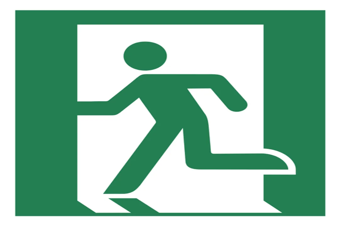
The Japanese design that emerged was specific: a person actively running toward an exit opening. [5][9] This design was considered superior because it visually communicated the action required—moving quickly—rather than just identifying the location. [1] This shift was subtle but profound. It moved the purpose of the sign from being a label to being an instruction. [1] It’s fascinating to observe how this early focus on motion became the defining feature of the global standard later on. [5]
The specific shade of color also became a point of differentiation. While the older American and European standards favored red, the Japanese design embraced green, which is often associated with safety and go-signals. [8] This choice helped separate the emergency directive from general warning signs, which frequently utilized red or yellow. [8]

# Global Rule Set
The need for a unified, internationally understood exit sign became increasingly apparent as global travel and commerce expanded in the latter half of the 20th century. [6] This push for uniformity culminated in the creation of ISO 7010, the international standard for graphical symbols used on safety signs. [6]
The specification ISO 7010 E001 is the official designation for the running man exit sign. [6] This standard formalized the design elements: a white or light-colored figure in motion, set against a contrasting green background. [6][2] The adoption of this symbol was a victory for international collaboration in safety engineering, aiming for consistency across borders. [6]
It is important to note that adoption wasn't instantaneous or universal. While many countries embraced the ISO standard relatively quickly, regions with deeply entrenched, older, and fully regulated systems—like the United States—often experienced a slower phase-out or maintained parallel standards for some time. [8] For example, while the green running man is now common in US construction, many legacy buildings still feature the red "EXIT" sign, showcasing the inertia of established infrastructure. [8] This highlights a real-world friction point: implementing universally superior safety design often requires overcoming the cost and regulatory hurdle of replacing existing, functional, albeit suboptimal, equipment. [8]
# Key Sign Comparison
The evolution from text to symbol can be clearly seen by comparing the characteristics of the dominant pre-ISO and ISO signs:
| Feature | Traditional Text Sign (e.g., US/UK) | ISO 7010 Running Man |
|---|---|---|
| Primary Element | Word (e.g., "EXIT") | Pictogram (Running Figure) |
| Primary Color | Red | Green |
| Communication Style | Identification (Location Label) | Instruction (Action Required) |
| Language Barrier | High | Low/None |
| Standardization | National/Local | International (ISO 7010 E001) |
| [8][6] |
# Symbol Logic
The effectiveness of the running man sign lies in its masterful application of graphic design principles tailored for emergencies. Its primary goal is clarity under duress. The design needed to convey escape quickly, without ambiguity, and without requiring cognitive processing time needed for reading. [2]
The figure itself is simplified to the absolute necessary components: a torso, two limbs in a running posture, and a clear directional arrow implied by the movement. [1] Crucially, the design communicates urgency without necessarily causing panic. If the figure were shown crawling or collapsing, it might induce fear; if it were merely walking, it wouldn't convey the necessary speed for an emergency situation. [1] The specific posture locks in a moderate-to-high level of necessary haste, acting as a subtle, non-verbal nudge toward swift, orderly evacuation. This balance is a hallmark of expert safety communication.
Another key element, often mandated by the standard, is the use of high contrast. Whether white on green or green on white (often seen when the sign is backlit), the distinct color pairing ensures visibility even in smoke or low-light conditions where color perception might be slightly degraded. [2]
# Modern Context
Today, the running man is nearly ubiquitous in newly constructed public spaces worldwide, thanks to its inclusion in ISO 7010 and subsequent adoption into national building codes globally. [6] This widespread acceptance supports the principles of Universal Design—designing environments to be usable by all people, to the greatest extent possible, without the need for adaptation or specialized design. [2]
In contemporary safety planning, the running man often works alongside supplemental directional signs, like the green arrow signs which clarify the path when the main exit doorway is not directly visible. While the ISO standard focuses on the primary sign, the evolution of signage systems now incorporates these directional aids, often using the same color palette to maintain visual continuity. [2]
Looking at its journey, the running man sign tells a story about how safety communication matured over the 20th century—moving from a dependence on local language and convention (like the red 'stop' color) toward an evidence-based, universal visual language that prioritizes immediate, instinctual comprehension above all else. [8] The little green man didn't just replace a word; it replaced a language barrier with an act of motion.[1]
#Videos
A Brief History of the Exit Sign | ARTiculations - YouTube
Related Questions
#Citations
A Brief History of the Japanese Exit Sign (also known as the ...
Running Man Exit Sign
Exit sign - Wikipedia
A Brief History of the Exit Sign | ARTiculations - YouTube
Designs That Defined Modern Japan: The Emergency Exit Sign
ISO 7010 E001 'Running Man' Exit Sign
The Big Red Word vs. the Little Green Man
A history of room escapes – where did the international exit sign (or ...
STG Aerospace's Post - LinkedIn