Who came up with the recycling symbol?

The ubiquitous symbol representing the cycle of materials—three chasing arrows forming a continuous loop—is recognized worldwide as the emblem of environmental responsibility. Its creation wasn't the result of a decades-long corporate initiative, but rather the quick thinking of a young student in the early 1970s, motivated by an urgent need for visual standardization in waste management.[1][3]
The person responsible for designing this enduring graphic identity is Gary Anderson. At the time of the symbol’s genesis in 1970, Anderson was a 23-year-old student studying environmental science at the University of Southern California (USC). [1][5][10] He was looking for a design that could signify something that could be recycled, something that showed a closed-loop system. [2]
# The Competition

Anderson's winning design emerged from a nationwide contest held by the Container Corporation of America (CCA). [3][5] The CCA, a major paperboard packaging manufacturer, sponsored the competition, offering a $1,000 prize for a suitable graphic that could be printed on packaging to identify materials destined for recycling. [5][9] This contest aimed to address the growing awareness of waste and the need for public education regarding resource recovery. [1]
Anderson needed to create a mark that was easily reproducible, recognizable, and conveyed the core concept of cyclical use. His inspiration came from a well-known mathematical concept: the Möbius strip. [1][5] A Möbius strip is a surface with only one side and only one boundary component, created by taking a strip of material, giving it a half-twist, and joining the ends. [1] By folding this concept into three chasing arrows, Anderson visually represented the continuous process of collection, processing, and manufacturing into new products. [5] The design was selected from hundreds of entries submitted to the contest. [10]
# Wider Adoption

While Anderson's winning submission was specifically designed for cardboard and paper products, [1][9] its immediate success and simplicity allowed it to transition quickly into a general symbol for recycling across different material streams. [9] It became a universal shorthand for environmental concern, moving far beyond the initial scope of paper goods. [1]
This shift in application is where the story gains complexity. When the symbol began appearing on plastics, it often carried an unspoken expectation that the arrow configuration itself indicated which plastic it was, or that it was definitively recyclable curbside. [4] This led to widespread confusion among consumers, as the Mobius loop was applied liberally across packaging without consistent meaning. The original design, which represented a process rather than a specific material, lacked the nuance required for the burgeoning plastics industry. [5]
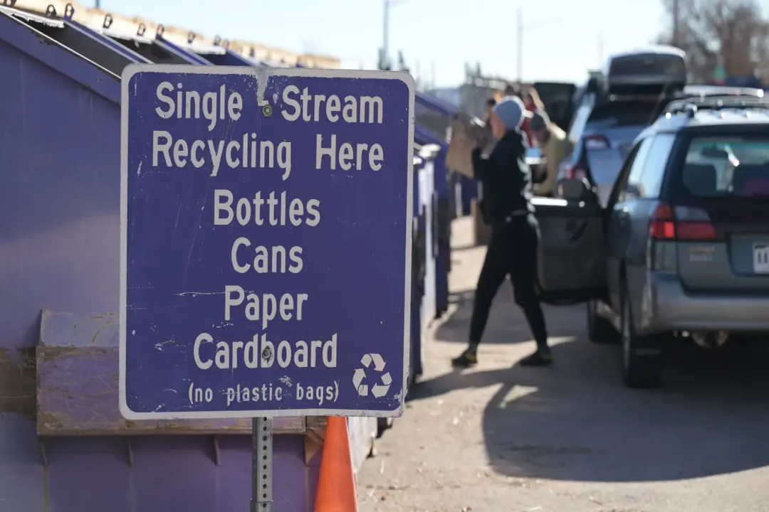
A key distinction often overlooked today is that Anderson’s original Mobius loop does not inherently contain information about the plastic type. In modern recycling, the arrows usually surround a number—the Resin Identification Code (RIC)—which specifies the type of plastic resin used (e.g., PETE is 1, HDPE is 2). [1][4] It is this RIC number, often positioned inside or beneath the loop, that is the crucial piece of information for processors, not the loop design itself. [4] Anderson’s simple, elegant design became the container for much more complex sorting data, a fact that sometimes obscures its original, singular message of cyclical potential. [9]
# Symbol Clarity

Perhaps the greatest challenge the symbol faces today is the disconnect between what it communicates and the reality of local recycling infrastructure. The presence of the chasing arrows often leads people to believe an item is recycled, when in truth, it is only designated as recyclable—meaning it can technically be processed somewhere in the world. [4][6]
For instance, a product marked with the symbol might use a plastic resin that your specific Material Recovery Facility (MRF) cannot process economically or safely, leading it straight to landfill despite the hopeful marking on the packaging. [6] This discrepancy between designation and capability has led to criticism, with some advocates suggesting the symbol is misleading or even greenwashing when applied to items that rarely complete the loop in practice. [4][9]
If we consider the sheer variety of materials used in modern packaging—from multi-layered pouches to certain types of colored glass—it becomes apparent that a single, simple icon cannot capture the necessary regulatory detail. [6] While Anderson provided the universal concept, the actual execution relies on local municipal sorting rules and industrial capacity, details the original $1,000 winning design could not possibly foresee.
Considering the current landscape, a helpful practice involves treating the symbol not as a guarantee but as a starting point for inquiry. When you encounter the chasing arrows, especially on plastics, it is worthwhile to check if the accompanying RIC number corresponds to accepted materials in your area. For example, in many US jurisdictions, plastics numbered 1 and 2 are widely accepted, while numbers 3 through 7 face much higher rejection rates. [6] Understanding that the symbol invites participation, rather than dictating compliance, shifts the consumer mindset toward active verification, bridging the gap between intent and outcome. [4] Gary Anderson’s design remains effective at signaling intent, but local data provides the instruction. [10]
#Videos
The Recycling Logo: The History and Meaning of the Iconic ...
Related Questions
#Citations
Recycling symbol
History of the Recycling Symbol
The History of Recycling Symbols
The Hidden Truth Behind Recycling Labels Revealed
How the recycling symbol got America addicted to plastic | Grist
Cracking the (recycling) code
History of the Recycling Symbol - Houston
The Recycling Logo: The History and Meaning of the Iconic ...
His Recycling Symbol Is Everywhere. The EPA Says It ...
The Origin of the Recycling Symbol